The Gambling Angler is a Bristol Channel sea-fishing coach and guide. The knowledge was always there—what to do on certain tides, how to approach a tricky shoreline, which rigs are worth learning first. The problem was turning that know-how into a reliable engine for discovery and bookings. Posts went up sporadically, calls-to-action were inconsistent, and arranging a session often turned into a long message thread.
This case study explains what changed after moving to Clubnest: a clean content structure, a writing flow that removes friction, and a booking setup that respects both the coach’s calendar and the client’s time. Put together, those pieces created a flywheel. Helpful guides bring people in; clear navigation keeps them reading; consistent prompts lead to a simple booking path; the experience builds trust; and each new guide makes the whole site more useful than the day before.
Where we started
• Publishing happened in bursts, then went quiet.
• Each post made its own rules for layout, images, and buttons.
• Readers often reached out with good questions, but it took time to reply, schedule, and confirm.
• The coach spent more time juggling admin than capturing the lessons learned on the water.
The aim was not a redesign for the sake of it. The aim was to give the coach rails to run on: a predictable way to turn ideas into guides, guides into journeys across the site, and journeys into real-world sessions.
The system we set up (and why it matters)
- Hubs that mirror how anglers actually think
Clubnest’s Guides feature uses categories. We chose three hubs that match how readers learn: Techniques, Venues, and Kit. Every guide now strengthens one hub. This sounds simple, but it changes behavior. When the coach has a new idea, he knows where it belongs. When a reader lands on any guide, they immediately see where they are and what’s nearby. People who arrive looking for “shore bass basics” naturally drift into a venue primer or a kit checklist without feeling sold to. That’s traffic growth the honest way: it’s easier to keep exploring because the structure makes sense. - A writing form that does the heavy lifting
Inside the admin, the Guide form asks for the things readers consistently value: a clear title, a short summary, the main steps, a tide/safety note, a kit list that focuses on principles rather than brands, and a couple of “what to try next” pointers. There’s an optional FAQ area for the follow-up questions that pop up in messages. Images are added through a media picker; the system handles sizing and performance behind the scenes. Because the form is opinionated, the coach stops worrying about layout and starts typing. Ideas move from phone notes to live pages quickly. More good guides published with less friction is the single biggest reason more people now arrive and return. - “Related reading” that feels helpful
Every guide ends with a short “Further reading” block that pulls in three relevant pieces. It’s not clever; it’s useful. If you’ve just read how to handle a windy evening on a certain shoreline, the next logical thing is a simple rig to tie or a checklist for the first hour on arrival. Readers click because they want the next step, not because they were pushed. Time on site increases, but more importantly, confidence increases. When people feel confident, they book. - Consistent prompts that respect the reader
We settled on one call-to-action near the top of the page and the same one again at the end. The copy doesn’t shout. It simply says: “Want to put this into practice? See sessions and availability.” The button goes to a single “Trips and Coaching” page that answers the obvious questions and shows simple options. Because the wording and placement are always the same, readers don’t have to hunt. The predictability builds trust. Over time, more readers try the button because it feels like a natural next step rather than a detour. - Bookings that work the way guiding actually works
The booking setup reflects the real constraints of the Bristol Channel: tide windows, evening bites, and the coach’s availability. There are a few clear products (1:1 shore session, two-angler guided trip, small-group workshop). Each has a plain description, typical meeting points, and what to bring. The calendar only opens sensible slots; there’s a lead-time buffer; deposit or full payment is supported; confirmations and reminders arrive on time. If the weather turns, moving a booking is painless. The result is fewer messages, fewer missed chances, and more days on the water. Crucially, it also improves word-of-mouth: a tidy, predictable booking experience gets recommended. - A small habit that compounds: publish, then refresh
The coach publishes one guide a week most weeks. The winning pieces get tiny updates—a tighter opening, a new photo, a clearer diagram—rather than getting replaced. That small habit is where “natural traffic” comes from. The site remains alive; new people keep discovering it; returning readers bring friends. None of that needs a growth hack. It needs a system that makes publishing easy and improvement normal.
How this translates into more traffic without chasing it
• There’s somewhere to go next. When the page always suggests the next logical thing to read, people browse longer because they’re curious, not because they’re stuck.
• The writing is practical and repeatable. Readers come back to check a kit list or re-read a tide note before a session. That repeat behavior slowly raises the floor of daily visitors.
• The booking path is short. People who are ready to act can do it immediately. People who aren’t ready yet still had a good experience and often share a link with a friend.
• The calendar and the content calendar inform each other. If evening sessions fill up at a certain time of year, the coach writes about preparing for those evenings. The right people find the piece at the right time, then book.
• Good experiences generate quiet signals. A clear guide that answers a question gets saved, shared, and linked. That’s the kind of attention that lasts.
What changed day-to-day for the coach
• Less admin chasing, more teaching. Availability is visible; reminders go out; payments happen; rescheduling is a couple of clicks.
• Fewer “what now?” moments when writing. The form encourages the shape of a helpful guide every time.
• Confidence in hitting publish. Because the layout and images are handled, the coach can focus on getting the advice right.
• A shorter loop between water and website. An idea tested on a Tuesday can be a polished guide on Thursday.
The “Trips and Coaching” page that the buttons point to
We kept this page focused and human: a short intro that sets expectations, three simple options, a small FAQ, and the booking button. The most common pre-booking questions are answered in plain language: where we meet, what happens if the weather changes, what to wear, and what you’ll learn. When people don’t need to send a message to feel comfortable, more of them make a booking on the spot.
Small details that mattered more than expected
• A single place for contact. There’s one link for questions—email or WhatsApp—so people who want to check something can do it without friction.
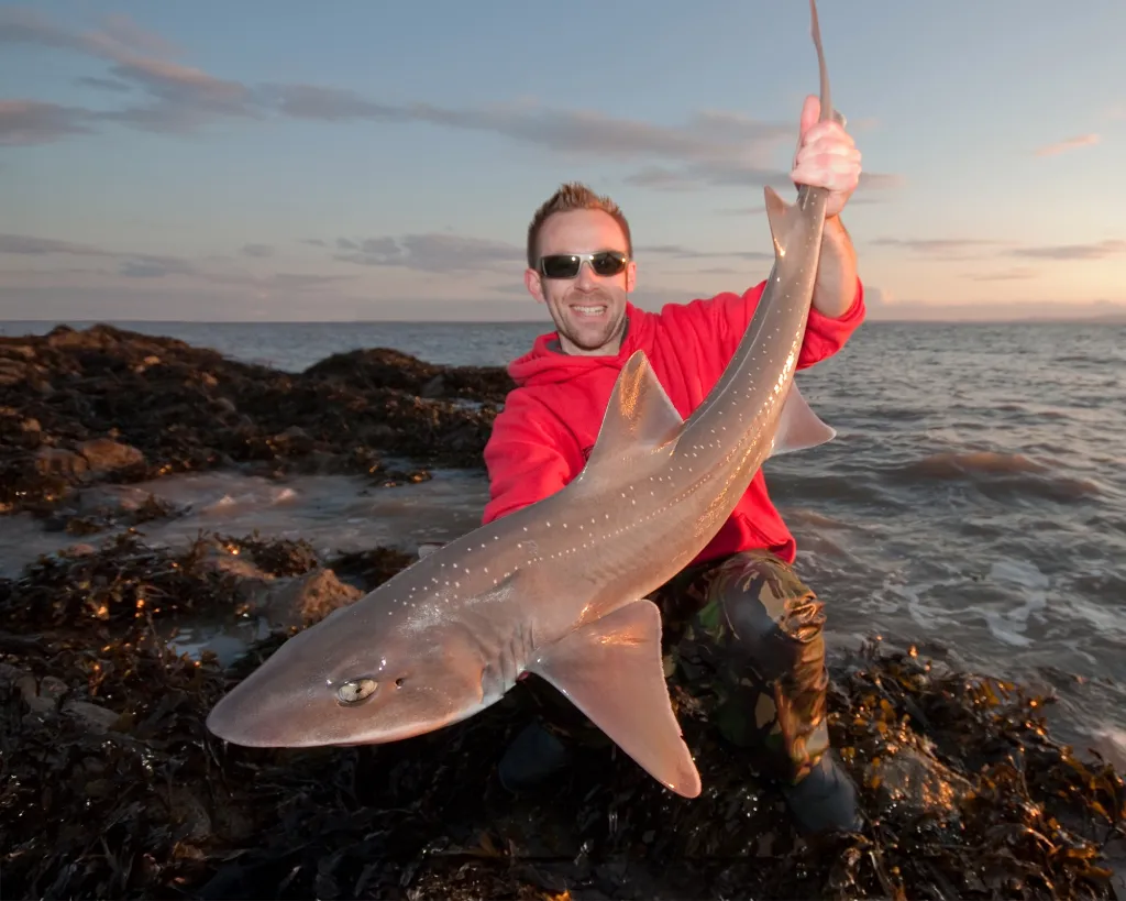
• Clear images with useful captions. Photos aren’t decoration; they show the shoreline, the rig outcome, or the view from a likely spot.
• A fixed safety note. Every technique guide includes a small box about footing, swell, and headlamp use. Readers appreciate it, and they remember the site that cared enough to include it.
• Gentle follow-ups. Booking confirmations and reminders include a packing list and a simple “reply to this email if anything changes.” That two-way line increases kept appointments and good reviews.
Examples of guides that pulled their weight
• “Your first hour on a new Bristol Channel shoreline”: a practical plan that helps readers avoid common mistakes. The comments and messages that followed were more focused, and many of those conversations turned into bookings.
• “Shore bass rigs you can tie today”: a guide that pairs a simple rig with a few success checks. People saved it, shared it, and later booked a session to learn the nuances.
• “Reading the evening window”: a short piece that clarified how to decide whether to go. It brought in a lot of returning readers—many of whom chose an evening coaching slot.
How readers move through the site now
A common path looks like this: someone hears about The Gambling Angler from a friend and lands on a technique guide. They read the steps, click a related venue primer, and then open the kit list to check if what they own is “good enough.” At the bottom, they see the same calm prompt they saw at the top. If they’re ready, they click “See availability” and choose a slot. If they’re not ready, they email a question or bookmark the guide. Either way, the experience was smooth. Later, when they’re stood on a shoreline, they pull the guide up again. That’s how loyalty and traffic build: not from one big spike, but from being genuinely useful in the moments that matter.
Why this works for a local, tide-sensitive guide business
• It respects time. The coach doesn’t waste it on avoidable admin; readers don’t waste it searching for basics.
• It reflects reality. Availability accounts for tides and personal schedule; the advice is grounded in specific places and conditions.
• It builds trust by being consistent. Layout, prompts, and next steps don’t change from page to page.
• It grows by being helpful. Each new guide reduces uncertainty for someone. Enough of those moments create momentum.
Lessons others can borrow
• Choose hubs first, then write inside them. It removes decision fatigue and helps readers understand your site at a glance.
• Use one call-to-action and repeat it. The consistency helps people act when they’re ready.
• Make a small writing checklist and use it every time. It speeds you up and keeps quality high.
• Let your calendar inform your content. If evenings are booking, write about evenings. If beginners keep asking the same knot question, write that guide next.
• Refresh, don’t replace. A good guide with a better opening is better than a new guide that repeats itself.
What we’ll add next
• A simple package option (two evenings across one week; parent-and-junior). One click, fewer decisions.
• A short printable checklist as a free resource. People love to leave with something they can use tonight.
• More tiny updates to winning guides. A photo swap or an extra paragraph often does more than a brand-new post.
Closing thought
Traffic and bookings improved because the whole experience improved. The Gambling Angler didn’t chase algorithms; he made a site that teaches clearly, respects the reader, and makes acting easy. Clubnest just made that way of working the default. The rest followed naturally.


